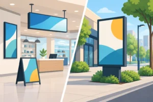
A new shopfront can be beautifully fitted out, a campaign can have excellent artwork, and an event can be perfectly planned – but weak signage installation can still leave customers wondering where to go. Signs need to do more than carry a logo. They must be visible from the right distance, legible in changing light and securely placed to support the way people move through a space.
For Singapore businesses, where retail frontage, event venues and commercial buildings are often busy and tightly managed, the planning behind a sign matters as much as its printed finish. The right approach protects your investment, keeps your brand presentation consistent and helps every customer find the information they need without hesitation.
Start with the job your sign needs to do
Before selecting a material or deciding on dimensions, identify the sign’s primary job. A shopfront sign needs to attract attention and establish identity. A wayfinding sign must direct people quickly. A point-of-sale display should bring focus to an offer at the moment of purchase, while event signage may need to manage queues, schedules and registration areas.
Trying to make one sign do every job usually produces a crowded result. A large exterior sign may only need a name, logo and simple descriptor. Opening hours, promotions, social media details and a long list of services are better placed on window graphics, counter displays or printed collateral inside the premises.
Think about the viewing distance as well. A sign viewed from across a road requires larger text and stronger colour contrast than one read at a reception desk. If customers will see it while walking past, they need to understand the message in seconds. If they will stand close to it, you can provide more detail, but clear hierarchy still matters.
Plan signage installation around the site
Good signage installation starts with a site survey, not a product catalogue. Measure the proposed area carefully, including available wall space, ceiling height, door clearances and any fixtures such as pipes, lights, sprinklers or shutters. Photographs from several angles are useful when reviewing artwork and mounting options.
Consider where customers approach from. A sign that faces the corridor may be ideal in a shopping centre, but a projecting blade sign can be more effective for a unit that is only visible from the side. For office premises, a directory sign near the lift lobby may do more practical work than a statement wall graphic hidden inside the unit.
Lighting deserves early attention. Direct sunlight can affect how colours appear and create glare on glossy surfaces. Dim corridors may call for illuminated letters, lightboxes or strategic spot lighting. Outdoor signs must also cope with rain, humidity and regular cleaning. The most economical material is not always the best value if it fades, warps or loses its finish before the campaign or tenancy ends.
Installation access is another practical consideration. Is the sign being fixed to a ground-floor wall, a high façade, a glass panel or a temporary exhibition structure? A ladder, scaffold, boom lift or specialist installation crew may be required depending on the location and scale. Access restrictions, loading bay timings and building work hours can affect both cost and schedule, so these should be confirmed before production is finalised.
Check permissions before printing
Landlords, building management teams and venue operators commonly have rules on signage size, placement, operating hours and installation methods. Exterior signs may also require approvals under relevant local requirements. The exact process depends on the property, location and type of sign, so it is wise to clarify responsibilities early rather than discovering restrictions once materials are ready.
Provide management with a clear visual mock-up, dimensions, proposed mounting method and any electrical requirements. This makes approval smoother and gives everyone confidence that the work will be safe, tidy and aligned with the building’s standards. For short-term events, confirm when installation and removal can take place, particularly where public access or other exhibitors are involved.
Choose materials for use, not just appearance
The surface, setting and intended lifespan should guide material selection. Indoor wall graphics may suit vinyl applications, foam board or acrylic lettering, depending on the desired finish. Retail counters and promotional zones often benefit from lightweight standees, display systems and point-of-sale boards that can be updated with minimal disruption.
For outdoor use, weather resistance and structural stability become more significant. Aluminium composite panels, acrylic, PVC and suitable vinyl systems each offer different benefits. A premium fabricated sign with raised lettering can create a strong permanent presence, while a printed banner may be the practical choice for a launch, sale or limited campaign.
There is also a trade-off between flexibility and longevity. Temporary signs are easier to replace when promotions change, but permanent solutions generally create a more polished look for established brand touchpoints. A food and beverage operator refreshing monthly offers may prioritise interchangeable menu and promotional panels. A clinic, corporate office or boutique showroom may favour durable signs that reinforce trust over several years.
Finishing can lift a straightforward design. Matte lamination can reduce reflections, while gloss may make campaign colours appear more vivid. Raised acrylic letters, metallic effects and LED illumination add visual impact when used with purpose. These options should support the environment and audience, not overpower the message.
Create artwork that remains clear in the real world
A design that looks sharp on a laptop is not automatically ready for production. Text that appears readable on screen can become too small once viewed from a distance. Fine lines may lose definition, and low-resolution images can look soft or pixelated at large scale.
Use high-resolution artwork and vector logos wherever possible. Keep essential information away from trim edges, folds, frames and mounting points. For window graphics, remember that reflections, tinted glass and interior lighting can affect visibility. For directional signs, test the wording with someone unfamiliar with the site. If they cannot understand the route immediately, simplify it.
Brand consistency matters across every format. Your shopfront lettering, event backdrop, menu board, brochures and packaging should feel like parts of the same business. Consistent logo use, typefaces, colour values and tone of voice make the experience more recognisable and professional. This is especially valuable for growing brands operating across pop-ups, retail spaces, delivery packaging and corporate events.
A production partner can also advise on bleed, safe areas, colour expectations and suitable finishing before files go to print. That guidance is particularly helpful when artwork must work across several items at once, from a large-format wall graphic to smaller tabletop displays.
Make safety and durability part of the brief
A sign can look impressive on installation day and still fail if its mounting is unsuitable. Fixings should be matched to the wall or surface, the sign’s weight and the conditions it will face. Glass, plasterboard, concrete, metal cladding and temporary exhibition walls all require different approaches.
For illuminated signage, electrical components and cabling must be planned properly, with a clean route that does not create a hazard or distract from the finished display. Outdoor installations need secure fixings that account for wind and weather exposure. In high-traffic areas, avoid sharp edges, protrusions or placements that obstruct pedestrian flow.
Maintenance is often overlooked during the initial order. Ask how the sign should be cleaned, whether panels can be replaced individually and how easily graphics can be updated. A modular system may cost more upfront but reduce future campaign costs. Conversely, a one-off event display may not justify permanent hardware. The right answer depends on how often your message, location or promotion will change.
Coordinate print, installation and launch timing
Signage sits alongside many other launch requirements: fit-out works, stock delivery, staff training, menus, flyers, packaging and event equipment. Working backwards from the opening date helps prevent expensive last-minute decisions.
Allow time for site measurement, artwork preparation, approval, production and installation. Build in a buffer for revisions or access changes, particularly for shopping centre units, commercial buildings and major events. If the campaign has a fixed date, prioritise the elements that customers must see first, such as shopfront signs, directional boards and registration displays.
Using one supplier for related printed assets can make coordination easier. 2B Printing can support businesses with signage, display materials, promotional print and branded production, helping each item arrive with a consistent look and a clear purpose. That is useful when speed matters but presentation cannot be compromised.
The best sign is not simply the largest or most elaborate one. It is the one that meets customers at the right moment, says exactly what they need to know and looks every bit as professional as the business behind it. Plan the placement early, select materials that suit the environment and give the installation the attention it deserves – your brand will be easier to find, trust and remember.