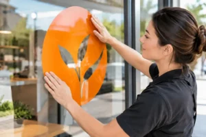
A plaque is often presented in a brief moment: an employee steps forward, a guest unveils a sign, or a partner receives thanks at an event. Yet plaque engraving remains visible long after the applause. The right material, wording and finish turn that small object into a lasting marker of achievement, trust or appreciation.
For businesses, plaques do more than display a name. They carry your brand into boardrooms, reception areas, retail spaces, project sites and award ceremonies. That means every choice matters, from the readability of the text to the tone of the metal.
What plaque engraving needs to achieve
The best plaques are clear at first glance and rewarding on closer inspection. A recipient should immediately understand what is being recognised, while the organisation behind it should feel polished and considered. This balance is especially valuable for corporate awards, service milestones, donor recognition, safety records, opening ceremonies and commemorative displays.
Start with the setting. A plaque for a formal annual award may suit a classic metal finish and traditional typography. A retail brand celebrating a creative campaign can take a more contemporary route with acrylic, colour printing or layered elements. For an office wall, durability and consistency with existing signage usually matter more than decorative detail.
The intended lifespan also shapes the specification. A desk award that will move between offices has different requirements from a wall plaque installed outdoors. Indoor pieces allow for a broader choice of finishes, while external plaques need materials and engraving methods that can handle moisture, sunlight and regular cleaning.
Choosing materials for plaque engraving
Material influences both the look and the practical performance of a plaque. There is no single best option. The right choice depends on your budget, brand style, display location and quantity.
Metal for classic authority
Aluminium, stainless steel and brass-style plaques are popular when the occasion calls for permanence. Brushed metal creates a refined, professional appearance that suits corporate recognition and facility signage. Engraved lettering can be darkened or colour-filled to improve contrast, particularly when names and dates need to remain easy to read from a distance.
Stainless steel is a strong candidate for demanding environments because it has a clean, modern look and resists everyday wear. Aluminium is lighter and versatile, making it useful for larger runs or mounted signage. Brass offers warmth and heritage, although it may need more consideration where tarnishing or outdoor exposure is a concern.
Acrylic for modern presentation
Acrylic plaques bring a crisp, contemporary feel. Clear, frosted, black and coloured acrylic can be used alone or combined in layers for depth. This makes it a smart choice for creative awards, startup milestones, retail displays and event recognition pieces where the design needs to reflect a more energetic brand personality.
Acrylic is not automatically less formal than metal. With clean engraving, thoughtful spacing and a quality base or mounting system, it can look exceptionally premium. However, fine scratches may show more readily on some surfaces, so it is worth matching the finish to how the plaque will be handled and displayed.
Wood for warmth and distinction
Wood plaques lend a sense of craftsmanship and personal value. They work well for long-service awards, sporting recognition, school achievements and heritage-inspired branding. The natural grain means every piece has subtle variation, which is part of its appeal, but it also means colours and engraving contrast can differ slightly from one plaque to another.
For a consistent corporate programme, choose a timber tone that complements your logo and existing interiors. A darker wood with a metal engraving plate is a familiar format, while direct engraving gives a more understated result.
Getting the wording right before engraving begins
An engraving error is not like a typo in a digital document. Once the plaque is produced, correcting a name, date or title usually means remaking it. A careful approval process protects your timeline and budget.
Keep the hierarchy simple. The organisation or award name usually comes first, followed by the recipient’s name, the reason for recognition and the date or event. If your logo is included, allow it enough space to be recognisable without competing with the message.
Short wording often has greater impact. “In appreciation of 10 years of dedicated service” is direct and meaningful. A full paragraph about the recipient’s achievements may be better delivered in a card, speech or certificate, leaving the plaque to communicate the essential recognition with confidence.
Check the details with the people closest to them. Confirm spelling, preferred name format, job title, post-nominal letters and dates. For group awards, make sure the team or department name follows the same style used elsewhere in your business. Consistency makes a recognition programme feel established rather than improvised.
Design choices that protect readability
Plaques have limited space, so good design is mainly about restraint. A strong layout uses one or two typefaces, clear contrast and comfortable margins. Decorative fonts can look attractive in a preview but become difficult to read when engraved at a small size.
Sans-serif fonts generally suit modern plaques and compact text. Serif fonts can bring a formal, ceremonial character to larger headings. Script fonts are best reserved for a short name or a single highlight, not for the full message. If the plaque is likely to be viewed from several metres away, enlarge the key line rather than trying to include more copy.
Logos need suitable artwork too. A high-resolution vector file produces cleaner edges than a small image copied from a website or presentation. Complex gradients, extremely thin lines and tiny reversed text may not translate well through every engraving process. Sharing the intended artwork early allows production specialists to recommend practical adjustments before the design is finalised.
Engraving methods and finishes
Laser engraving is highly versatile and precise. It is commonly used on acrylic, wood, coated metals and selected metal surfaces, creating sharp text and detailed logos. It suits personalised orders because individual names can be changed efficiently while the core design remains consistent.
Rotary engraving physically cuts into the material. It can create a deeper, tactile mark, particularly on engraving laminates and certain metals. This method can be a strong option where longevity and a traditional engraved appearance are priorities.
The finish should support the message, not distract from it. Brushed silver with black lettering is clean and corporate. Gold-toned finishes bring ceremony to annual awards and retirement gifts. Black plaques with engraved metallic lettering offer high contrast and a contemporary edge. For a more distinctive piece, consider layered acrylic or a printed colour element paired with engraved text.
If the plaque includes variable information such as names, achievements or serial numbers, keep the fixed brand design separate from the personalised fields. This makes repeat ordering quicker and helps every award maintain the same professional standard.
Planning plaques for events and corporate programmes
Timing can be the difference between a smooth presentation and a rushed compromise. Finalise recipient names only when necessary, but lock the material, dimensions, logo placement and overall wording template well ahead of the event. This gives room for artwork checks, proof approval and finishing choices.
For larger programmes, ordering all plaques together usually improves consistency across colour, materials and layout. It also helps you plan practical details such as individual presentation boxes, wall mounting holes, desk stands or protective sleeves. These elements are easy to overlook, but they shape the recipient’s experience.
Singapore businesses often need awards and event materials alongside certificates, display boards, banners and branded gifts. Working with a one-stop production partner such as 2B Printing can reduce the back-and-forth between separate vendors while keeping the visual treatment aligned across the full event.
Before confirming production, review four essentials: the approved wording, the artwork quality, the mounting or display method, and the delivery deadline. These checks are straightforward, but they prevent most costly last-minute changes.
Make the plaque feel worth keeping
A memorable plaque is not necessarily the largest or most elaborate. It is the one that feels intentional – with a message that sounds human, materials that suit the occasion, and engraving that remains crisp for years. Give the final wording and finish the same attention you would give a customer-facing brochure or a reception sign. Recognition deserves to look as considered as the achievement behind it.