A customer may only hold your product for a few seconds before deciding whether it belongs in their basket. That is why custom stand up pouches printing is more than a packaging decision. It is a practical way to protect what you sell, make your brand recognisable and give customers confidence before they even try the product.
For food and beverage operators, retailers and growing consumer brands in Singapore, a well-made pouch can do several jobs at once. It can preserve freshness, display essential information, support convenient storage and create a polished presence on the shelf, at a pop-up or in an online order. The best result comes from planning the pouch around the product and the customer experience, not simply placing a logo on a standard format.
Why custom stand up pouches earn their shelf space
Stand up pouches are popular because they balance function with visual impact. Their gusseted base allows them to stand upright, giving your product a stronger profile than a flat bag. They are also lightweight and space-efficient, which can make handling, storage and distribution simpler for businesses managing regular stock replenishment.
The format suits a broad range of products: coffee beans, tea, snacks, confectionery, dried goods, health supplements, pet treats, bath salts and many other retail items. Yet the pouch itself should never be treated as one-size-fits-all. A small premium tea brand may need a refined matte finish with metallic accents, while a family snack range may benefit from bright colours, clear product visuals and easy-open features.
Good packaging also gives your brand room to speak clearly. The front panel can create an immediate impression with your logo, product name and key selling point. The back panel can carry ingredients, usage instructions, nutritional information, storage advice, contact details and a barcode without making the design feel crowded. This is especially valuable for new brands that need every pack to build trust.
Start with the product, not the artwork
Before choosing colours or finishing options, consider what the pouch needs to do. Product weight determines the pouch size and material strength. The contents may require a barrier against moisture, oxygen, light or odours. Powdered products, oily foods and products with a strong aroma can each demand different material considerations.
Shelf life matters too. If your product must remain fresh for an extended period, speak with your printing partner about suitable barrier properties and closure options. A resealable zip can add convenience for products designed to be used over several occasions, while a tear notch can make the first opening easier. For coffee and certain products that release gas after packing, a degassing valve may be appropriate.
Think about how and where customers will use the product. A pouch for office pantry snacks may need to be easy to open and reseal. A gift-ready speciality product may call for a more premium tactile finish. If it will be displayed in a chilled setting, transported frequently or handled in busy event environments, durability becomes a key priority.
These details affect cost, appearance and performance. Choosing the most premium option is not always the right answer. The right pouch is the one that supports your product quality, price point and brand promise without creating unnecessary production expense.
Make the front panel work harder
Retail packaging has to communicate quickly. From a short distance, a shopper should be able to identify the brand and product category. Up close, they should find the information that helps them choose with confidence. This calls for hierarchy rather than decoration.
Place your brand name and product name where they can be read at a glance. Use a concise product benefit if it genuinely differentiates the item, such as a key flavour, dietary feature or origin statement. Avoid trying to say everything on the front. Too many claims, icons and competing typefaces can make even a high-quality pouch look uncertain.
Colour should reflect both your brand and your category. Rich, dark tones can signal premium coffee or chocolate. Fresh greens and natural neutrals may suit wellness-led products. Bold colour blocking can help a snack range stand out in a busy retail setting. Consistency across flavours or product variants is just as important: retain the core brand elements, then use a controlled colour system to make each variety easy to recognise.
A clear window can be useful when the product itself is visually appealing and supports the purchase decision. Customers may like to see nuts, granola or bath salts before buying. However, a window takes up valuable design space and may not suit products that need protection from light. It depends on what will make the product feel more credible and desirable.
Use finishes to match your positioning
The finish of a pouch changes how customers perceive it. Gloss can make colours appear vivid and energetic, which may work well for youthful snacks and promotional products. Matte finishes tend to feel understated and premium, particularly for artisanal food, beauty and wellness ranges. Some designs use a combination of effects to create contrast between selected elements and the background.
Specialist finishing can elevate a design when used with restraint. Foil details can draw attention to a logo or flavour name. Spot UV can add a subtle gloss to selected graphics. Embossing and other tactile details can make a product more memorable in hand. These techniques are most effective when they reinforce a clear brand direction, rather than becoming decoration for its own sake.
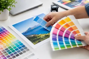
Before approving a full run, check colour proofs and artwork carefully. Colours can appear different on screen from their final printed form, particularly when using deep blacks, metallic shades or fine gradients. Small text, barcodes and regulatory information also need close review. A pouch that looks excellent in a digital mock-up still needs to function in the real world.
Prepare artwork that prints cleanly
Packaging artwork should be created to the supplied pouch template, including bleed, safe areas and seal zones. Keep important text and logos away from areas that may be folded, sealed or affected by the zip closure. If a design includes a window, ensure that surrounding artwork is positioned accurately so the finished layout remains balanced.
Use high-resolution images and vector logos wherever possible. Low-resolution graphics can look soft or pixelated when printed, immediately reducing the perceived value of the product. For a professional result, convert fonts to outlines where required and check that all linked images are included in the final production file.
Do not overlook the practical content. Ingredient lists, allergen declarations, net weight, expiry or best-before information, batch details and barcode placement may be essential depending on the product and sales channel. Leave sufficient space for variable information if it will be stamped or applied later. Clear, compliant information is part of good branding because it shows customers that your business is organised and trustworthy.
For first-time packaging projects, artwork guidance can save costly revisions. At 2B Printing, the focus is on helping customers turn creative ideas and functional requirements into polished packaging that is ready for display.
Plan quantities around your launch and growth
Ordering the correct quantity is a commercial decision as much as a print decision. Larger runs can improve unit costs, but they also tie up cash and storage space. This can be difficult when launching a new flavour, testing a seasonal campaign or still refining product-market fit.
Shorter runs may make more sense for pilots, limited editions and event sales. They allow you to learn which design, size or flavour earns the strongest response before committing to a larger order. For established bestsellers with predictable demand, higher volumes can provide better value and help maintain supply continuity.
Allow time for design approval, proofing, production, packing and delivery. If the pouch is needed for a retail launch, festive campaign or exhibition, build in contingency rather than waiting until the final week. Express options can be useful, but early planning gives you more choice over materials, finishes and costs.
Treat the pouch as part of a complete brand experience
The strongest packaging does not operate alone. It should feel connected to your stickers, thank-you cards, display stands, paper bags, flyers and event materials. When customers encounter the same colours, logo treatment and brand voice across every touchpoint, the business feels more established.
That consistency is particularly useful for brands selling through multiple channels. A pouch bought from a retail shelf, received in an online order or handed out at a sampling booth should look unmistakably yours. It gives your team a more coherent campaign platform and gives customers an easier reason to remember you.
Your product deserves packaging that works as hard as the product itself. Choose a pouch that protects the contents, presents the right information and gives your brand a confident place in customers’ hands.