A business card is often exchanged in a moment that moves quickly: after a client meeting, at a trade show, across a café table or during a site visit. Custom business card printing gives that small handover real weight. The right card does more than display a name and number. It makes your brand feel considered, credible and ready for business.
For Singapore businesses competing for attention, a generic card can quietly work against an otherwise polished brand. A well-chosen stock, confident layout and purposeful finish tell people that you care about details. Better still, they give them a reason to keep your card rather than let it disappear into a pocket or pile of event materials.
Why custom business card printing still matters
Digital contact sharing is useful, but it does not replace the personal value of a physical introduction. A business card creates a pause in the conversation. It gives a prospect something tangible to revisit, and it keeps your brand visible after the meeting ends.
That effect is especially valuable for founders, sales teams, property professionals, consultants, retailers and event organisers. In each case, trust is built through repeated signals. Your card may be the first physical piece of your brand someone sees, so its quality should match the standard of your product, service or venue.
Customisation also helps the card do a specific job. A restaurant group may use a bold card to support a premium dining identity. A creative studio might choose an uncoated textured stock that feels distinctive in the hand. A corporate procurement team may need clean, consistent cards for multiple departments, titles and locations. The format is small, but the possibilities are not.
Start with the purpose, not the finish
Before choosing paper or foil, decide what the card needs to achieve. Is it a straightforward contact card for everyday meetings? A high-impact networking piece for a launch event? A loyalty or appointment card that customers will carry with them? These uses call for different design and production decisions.
For high-volume staff cards, clarity and consistency usually matter most. A clean layout, readable type and durable stock will often outperform an overdesigned concept. For a senior executive, luxury retailer or premium service brand, a specialist finish can reinforce positioning, provided it does not make essential information harder to read.
It also pays to consider where the card will be used. Cards handed out at exhibitions need to communicate quickly in a busy environment. Cards delivered with online orders can be more expressive, perhaps carrying a thank-you message, a social handle or a short brand statement. If the card will be written on, such as an appointment or loyalty card, avoid heavily coated surfaces on the writing side.
Put the essential details first
A business card is not a brochure. Give the key details room to breathe: name, role, company, telephone number, email address and website or relevant social channel. Include a QR code only when it leads somewhere useful, such as a booking page, portfolio, digital catalogue or contact card.
Small type, overcrowded logos and too many messages reduce the card’s value. A recipient should understand who you are and how to reach you within seconds. White space is not wasted space – it is what makes the important details easier to find.
Choosing a size and orientation that suits your brand
The standard landscape business card remains popular because it fits wallets, card holders and filing systems easily. It is a reliable choice for professional services, corporate teams and businesses with substantial contact information.
That said, a vertical card can stand out while still feeling professional, particularly when the logo or brand mark has a tall composition. Square cards and custom die-cut shapes make a stronger visual statement, but they come with trade-offs. They may not fit standard card holders, can cost more to produce and are easier for recipients to misplace. Use unusual formats when the brand benefit is greater than the convenience cost.
A double-sided design is often the best use of available space. Keep the front focused on the logo or lead message, then place contact details, service categories or a QR code on the reverse. This approach maintains a clean presentation without forcing every element onto one crowded side.
Paper stock changes how your card is perceived
Paper is not simply a production detail. It affects colour reproduction, durability and the feeling a customer has when they hold the card. A lightweight card can feel economical, while a thicker stock suggests permanence and quality. Neither is automatically right – it depends on your brand, quantity and budget.
Silk or matte-laminated cards offer a smooth, refined surface and protect printed colours from everyday handling. They suit brands that want a neat, modern look. Gloss finishes make images and colour-rich designs appear more vivid, though they can show fingerprints more readily and may not suit cards that need handwritten notes.
Uncoated stocks have a natural, tactile quality. They work particularly well for artisanal food brands, independent retailers, architects and businesses that want a warm, understated presentation. Textured or speciality papers can add character, but test legibility carefully. Fine lines and small type may not reproduce as sharply on heavily textured surfaces.
For a more substantial result, consider thicker card or multilayer constructions. These can create an impressive edge profile and a premium hand feel, although they increase unit cost and may extend production time. For an everyday corporate card, a quality standard stock may be the more sensible investment. Save the elaborate materials for customer-facing roles or key campaigns where the impression has greater commercial value.
Finishes that add impact without adding clutter
Special finishes should support the design rather than compete with it. Spot UV adds a glossy, raised-looking contrast to selected areas, such as a logo, pattern or headline. It is particularly effective on dark matte backgrounds, where the change in texture catches the light.
Foil stamping creates a sharper premium accent in metallic or coloured foil. Gold and silver are familiar options, but coloured foils can be equally striking when they match a defined brand palette. Embossing or debossing gives the card physical depth, allowing a logo or mark to be felt as well as seen.
These finishes need careful artwork preparation. Very thin lines, tiny type and complex details may not produce as intended. They also add cost, so use them with purpose. One confidently finished feature is usually more memorable than several competing effects.
Build the artwork for print, not just for screen
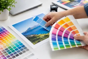
A design that looks excellent on a laptop can fail in print if the file is not prepared correctly. Use high-resolution images, allow for bleed around the edges and keep important text away from trim lines. Brand colours should be specified appropriately for print, as on-screen RGB colour can appear different once converted to CMYK.
Proofreading matters just as much as design. Check every phone number, email address, job title and URL before approval. For cards ordered across a team, create a clear template for names and roles so each version remains consistent. If you are unsure about margins, colour, stock or finishing limitations, artwork guidance before production can prevent costly reprints.
Plan quantities around real use
Ordering the lowest quantity is not always the most economical choice. If your team attends regular meetings, events or client visits, a larger run can lower the cost per card and prevent urgent reorders. On the other hand, businesses with changing titles, contact details or brand positioning should avoid over-ordering.
A practical approach is to separate stable brand cards from variable staff cards. Produce a longer run for evergreen inserts, promotional cards or loyalty cards, then order employee-specific cards in manageable batches. This keeps costs controlled while ensuring your materials stay current.
Turnaround should be part of the conversation from the beginning. Standard production is ideal when you can plan ahead, while express options are valuable for last-minute conferences, new hires and sudden campaign opportunities. Supplying approved artwork early gives you more flexibility on stock and finishing choices.
Bring your wider brand materials into the picture
Your business card should not feel like it belongs to a different company from your brochure, menu, packaging, event backdrop or storefront signage. Reuse core elements such as logo placement, typography, colour and tone so each printed item strengthens recognition.
This is where a one-stop production partner can save time. Instead of managing separate suppliers for cards, flyers, stickers, packaging and event materials, you can coordinate specifications and brand standards in one place. At 2B Printing, that means supporting the everyday essentials as well as the campaign pieces that help your brand make a lasting impression.
The best card is not necessarily the thickest, shiniest or most expensive one. It is the card that feels unmistakably like your business, makes contact details effortless to find and gives the recipient confidence to take the next step.