A plain parcel may get a product safely from A to B, but it gives customers little reason to remember who sent it. A well-considered box, pouch or paper bag does more: it protects the item, signals its value and makes the brand feel intentional from the first touch. That is why personalised packaging trends are moving beyond simply adding a logo. For Singapore businesses competing for attention on crowded shelves and in busy delivery channels, packaging is becoming a practical part of the customer experience.
Personalised Packaging Trends Shaping Brand Experience
The strongest trend is not a single finish, colour or material. It is packaging designed around the moment a customer receives, carries, opens or reuses it. A café customer may need a sturdy takeaway carrier that keeps food presentable on the journey home. A skincare brand needs a mailer that protects delicate bottles while making an online order feel considered. An event organiser may need gift boxes that look polished at registration and travel easily afterwards.
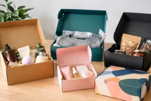
Personalisation gives businesses the freedom to adapt packaging to these real-world needs without losing brand consistency. It can mean a custom-printed stand-up pouch for a new snack range, tissue paper in a signature colour, a seasonal sticker for a limited release, or a presentation box finished with a subtle logo. The right choice depends on the product, order volume, budget and where customers will encounter it.
Packaging that feels specific, not generic
Customers are increasingly alert to details that suggest a brand has put thought into its presentation. A standard carton with an oversized logo can feel promotional. A simple box with a carefully placed mark, a short message inside the lid and an appropriate paper texture can feel more premium, even where the design is restrained.
This has created demand for thoughtful customisation rather than decoration for its own sake. Brands are using brand colours with greater discipline, selecting typefaces that work at small sizes and allowing enough empty space for packaging to feel clear rather than crowded. For a growing business, this is good news: distinctive packaging does not always require an elaborate design. It requires decisions that support the product and brand promise.
Short Runs Make Packaging More Responsive
Long print runs were once the obvious route to lower unit costs. They still make sense for high-volume, stable product lines, but they are less suitable when a business is testing a new flavour, preparing for a festive campaign or supplying a one-off corporate event. Digital print has made shorter, more targeted runs a more realistic option for many brands.
This flexibility is changing how packaging is planned. Instead of ordering one design for the entire year, businesses can produce a core pack design and introduce limited variants for Chinese New Year, Hari Raya, year-end gifting or a product launch. A retailer can trial two visual directions before committing to a larger order. A corporate team can personalise event packs by department, campaign or attendee group.
There is a trade-off. Small runs can carry a higher cost per piece, particularly where specialised materials or complex finishing are involved. Yet the total investment may be lower than holding thousands of outdated packs in storage. The most commercially sensible approach is often to reserve high-volume production for proven lines and use shorter runs for testing, seasonal activity and premium editions.
Variable details add relevance
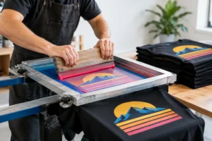
Variable-data printing is another useful development. Rather than printing every pack with identical wording, brands can change names, promotional codes, locations or messages across a run. This is especially effective for corporate gifting, membership campaigns and events where recognition matters.
Used carefully, variable details can make an item feel genuinely intended for its recipient. Used excessively, they can create artwork complexity and slow approval. Keep the changeable element purposeful. A personalised name, QR code or limited-edition number should add value, not become visual clutter.
Texture and Finishing Are Doing More Work
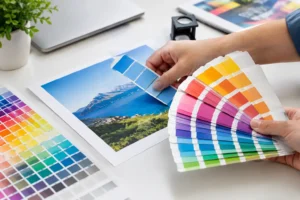
As more purchasing begins online, customers have fewer opportunities to judge a product before it arrives. The physical finish of the packaging therefore carries more weight. People notice the smoothness of a matte laminate, the raised impression of embossing and the contrast between a soft-touch surface and a crisp foil detail.
Premium finishing is no longer reserved only for luxury products, although it should be used selectively. Spot UV can draw attention to a logo or product name against a matte background. Foil stamping can add distinction to a gift box or special launch. Die cutting can create a shaped sleeve, viewing window or carry handle that improves both appearance and usability.
The key is alignment. A premium tea brand may benefit from elegant foil and textured stock. A youthful beverage label might be stronger with vivid graphics and a bold sticker. A sustainable homeware brand may choose uncoated paper and a one-colour print to support a more natural position. Every finish should reinforce the brand’s voice and justify its cost.
Sustainability Is Becoming More Visible and More Practical
Customers increasingly look at packaging through the lens of waste, but sustainable packaging is not a matter of adding a leaf icon or a broad environmental claim. It starts with using the right amount of material, selecting options appropriate to the product and communicating clearly.
Right-sizing is one of the most useful personalised packaging trends for e-commerce and food businesses. A package that is too large uses more material, takes up more storage space and can make the product feel less considered. A correctly sized box, pouch or bag can reduce filler, improve presentation and make handling easier for staff and customers.
Material choices need practical scrutiny. Paper-based packaging may suit dry goods, retail products and gift sets, while food items, liquids or oily products may require barrier properties that affect recyclability. Reusable paper bags can provide extended brand visibility, but only if they are strong enough and attractive enough to be kept. Businesses should avoid promises they cannot substantiate and focus instead on clear, credible choices.
A simple message about reuse or disposal can help customers make the right decision. Keep it concise and ensure it reflects the actual components of the pack, including labels, liners and any inserts.
Packaging Is Becoming Part of Campaign Design
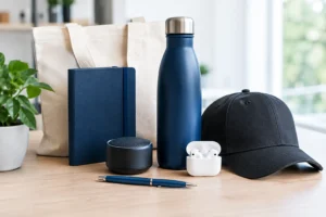
The best packaging does not sit separately from the rest of a campaign. It carries the same visual system found on shelf talkers, banners, brochures, loyalty cards and event displays. This is particularly valuable for businesses launching in retail, running pop-ups or preparing corporate activations, where every physical touchpoint needs to look connected.
Consider a new product launch. The outer carton may establish the visual identity, while stickers can identify variants, counter cards can explain product benefits and paper bags can turn each purchase into moving brand visibility. When these items are developed together, colours, finishes and messaging are easier to control. It also reduces the time lost coordinating multiple suppliers with different production specifications.
For brands that sell through both retail and direct delivery, the inside of the package deserves attention too. A printed insert can explain product care, invite a repeat purchase or introduce a related range. It should not be treated as an afterthought. A message that is useful and concise is more likely to be read than a generic sales leaflet.
How to Choose a Trend That Works for Your Business
Start with the product journey rather than the trend itself. Ask where the package will be seen, how far it needs to travel, whether customers will carry it publicly and what they should feel when they open it. These answers will guide the format, material and level of finishing.
Then set priorities. If protection is critical, invest first in structural strength and the correct size. If shelf impact matters most, focus on hierarchy, colour and legibility from a distance. If the package is intended for gifting, details such as ribbons, foil, embossing or a custom sleeve may be worth the additional spend. There is no benefit in choosing elaborate finishing if the packaging arrives damaged or the artwork is hard to read.
Artwork preparation also matters. Logos, colours and small text must reproduce well on the selected material and print method. First-time buyers benefit from discussing their intended use early, while experienced procurement teams can save time by sharing dielines, quantities, delivery dates and finish requirements from the outset. A production partner such as 2B Printing can help bring packaging, campaign print and event materials into one coordinated order.
The most effective packaging is not necessarily the loudest or most expensive. Choose the details that make the product easier to trust, easier to use and more enjoyable to receive. When every material, message and finish has a purpose, your packaging becomes a lasting expression of your brand’s voice.