A premium brochure that shifts in colour from one copy to the next does not feel premium. Nor does a retail box with a logo that appears slightly duller than the product range beside it. For brands ordering in volume, offset printing is often the production method behind the polished, consistent materials customers notice and teams rely on.
From catalogues and company stationery to folding cartons, event collateral and direct-mail campaigns, offset is designed for repeatable quality at scale. It is not automatically the right option for every job. Digital printing can be faster and more economical for small runs or variable information. But when quantity, colour accuracy and finish matter, offset offers a compelling balance of quality and cost.
What is offset printing?
Offset printing is a commercial print process that transfers an inked image from a metal plate to a rubber blanket, then onto paper, card or another suitable stock. The word “offset” describes that indirect transfer: the plate does not print directly onto the material.
Each ink colour uses its own plate. Most full-colour work is produced with CMYK – cyan, magenta, yellow and black – while dedicated Pantone colours can be added where a precise brand shade is essential. The process involves careful set-up, but once the press is running, it produces highly consistent results across substantial quantities.
That consistency is the real commercial advantage. A company preparing 5,000 product leaflets, 10,000 menus or a nationwide campaign needs every piece to represent the brand with the same confidence. Offset makes that achievable while reducing the unit cost as volumes rise.
Why offset printing earns its place in brand production
Offset is valued for more than just putting ink on paper. It gives businesses greater control over how printed materials look, feel and perform in the real world.
Reliable colour across the full run
Brand colours are not simply decorative. They build recognition across a business card, a counter display, packaging sleeve and exhibition backdrop. Offset printing handles solid colour areas, gradients and fine imagery with excellent consistency, particularly on longer runs.
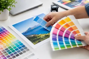
For brands with strict colour guidelines, Pantone spot colours can provide a more dependable result than relying on process colour alone. This is especially useful for signature colours, metallic inks and shades that are difficult to recreate accurately in CMYK. The stock, coating and lighting still affect perceived colour, so approving a proof remains a sensible part of the process.
Sharp detail and a refined finish
Small text, detailed line artwork, intricate patterns and high-resolution product photography all benefit from the precision of offset. The result can feel crisp, rich and considered – exactly what is needed for annual reports, lookbooks, restaurant menus, premium invitations and retail packaging.
It also opens the door to finishes that make physical print work harder for the brand. Matt or gloss lamination can protect a cover and change its visual character. Spot UV can bring selected logos or imagery into focus. Foil stamping, embossing, die cutting and hot stamping add texture and distinction where the occasion calls for it.
The best finish is not always the most elaborate one. A restrained blind emboss on a thick uncoated card may say more about a luxury service than several decorative effects used at once. The right choice depends on your audience, budget and how the item will be handled.
Better value for larger quantities
Offset has initial set-up costs because plates must be created and the press prepared. That makes it less attractive for a few dozen flyers or an urgent short-run test. However, those fixed costs are spread across the quantity as the run increases, making offset increasingly cost-effective for larger orders.
There is no universal threshold at which it becomes the better option. Page count, paper size, number of colours, finishing requirements and delivery deadline all influence the calculation. As a practical rule, it is worth requesting an offset quotation whenever your campaign, catalogue, brochure or packaging order reaches into the hundreds or thousands.
When should you choose offset printing?
Offset suits work that needs a consistent, professional finish across a meaningful volume. It is particularly effective for brochures, flyers, booklets, catalogues, folders, letterheads, envelopes, presentation materials, branded forms, product inserts and packaging.
It is also a strong choice where the printed piece is central to the customer experience. A café menu handled throughout the day must look good and stand up to use. A retail carton must protect the product while making the shelf presentation feel intentional. A corporate folder needs to hold documents neatly and reinforce trust before a meeting has even begun.
For event organisers, offset can be ideal for programmes, sponsor books, printed invitations and high-volume promotional materials. For marketing teams, it supports campaigns where every branch, sales representative or event location must receive materials with the same approved look.
Digital printing may be the smarter route if your quantity is low, your artwork changes from copy to copy, or timing is exceptionally tight. Personalised mailers, limited trials, short menu updates and small batches of event materials are common examples. The right method is the one that meets the objective without paying for capacity you do not need.
Preparing artwork for an offset print run
Good production begins before the press. Well-prepared artwork helps protect colour, reduces avoidable delays and ensures the finished piece matches what your team approved.
Start with the final size, fold type and number of pages. A tri-fold leaflet, saddle-stitched booklet and perfect-bound catalogue each need different layouts and allowances. If your item will be die cut, use a supplied cutter guide and keep vital text and logos safely inside the designated area.
Images should be high resolution at the final printed size. Artwork intended for professional print should generally be supplied in CMYK rather than RGB, which is designed for screens and can display colours that ink cannot reproduce. Include bleed around the trim edge so background colours and images extend cleanly to the edge after cutting. A 3 mm bleed is commonly used, though the production specification should always take priority.
Black requires special care. Small black text should usually use 100% black only, helping it remain sharp and avoiding registration issues. For large, deep black backgrounds, a richer black mix may be recommended to avoid a washed-out appearance. This is one of those technical details where artwork guidance can save a costly reprint.
Finally, check the content as carefully as the design. Confirm telephone numbers, QR codes, product information, prices, dates and legal copy before approval. Offset printing is efficient at reproducing thousands of copies, including any mistake that slips through the final proof.
Choosing paper, board and finishing with purpose
Paper stock changes how customers interpret your message. Gloss coated paper gives photographs and colourful graphics energy, making it well suited to promotional flyers and product-led brochures. Matt coated stock creates a more understated, contemporary look and is often chosen for corporate literature and premium catalogues.
Uncoated paper has a natural texture that works beautifully for stationery, artisan brands and designs with a tactile, considered feel. Heavier card adds authority to business cards, folders and postcards, while packaging board needs to be selected for both appearance and the practical demands of packing, stacking and transport.
Finishing should support the job, not compete with it. Lamination helps protect frequently handled items such as menus, cards and packaging. Spot UV adds contrast to a logo or hero image. Foil can create a memorable first impression on certificates, invitations or gift packaging. If an item needs to fold, be written on, refrigerated or packed with food, tell the production team early so the material and finish can be specified appropriately.
A more efficient way to manage print projects
Print becomes difficult when business essentials, campaign pieces, packaging and event displays are handled by separate suppliers with separate specifications. Working with a one-stop production partner keeps colour references, artwork standards and brand expectations closer together, while making ordering easier for busy teams.
At 2B Printing, offset work can sit alongside digital print, signage, packaging, branded merchandise and event materials, so a campaign can be planned as one connected physical experience rather than a collection of unrelated orders. Whether you arrive with a press-ready file or an early idea, clear guidance on stock, quantity and finishing helps turn the brief into something customers will want to keep.
The most effective printed piece is not necessarily the glossiest or the most expensive. It is the one that feels unmistakably like your brand, arrives when it is needed and performs its job beautifully in someone’s hands.