A menu is handled more often than almost any other branded item in your restaurant. It sits in customers’ hands at the moment they decide what to order, how much to spend and whether your venue feels worth returning to. This restaurant menu printing guide will help Singapore F&B operators turn that everyday touchpoint into a clear, durable and persuasive part of the dining experience.
A beautifully photographed dish cannot rescue a menu that is difficult to read, too flimsy for table service or badly sized for the setting. Equally, the most premium paper stock is not always the right investment for a high-turnover café. The best choice comes from matching your menu format and finishing to the way your team serves, the environment it operates in and the impression your brand needs to make.
Start with how customers will use the menu
Before choosing paper or requesting a quotation, decide how the menu will work during a typical service. A fine-dining restaurant may need a concise, well-spaced dinner menu that feels considered and complements table presentation. A hawker-inspired eatery, casual restaurant or quick-service counter may need a compact format that lets guests decide quickly and withstands frequent handling.
Think about where the menu appears. Table menus need to sit comfortably beside crockery and drinks. Counter menus must be visible from a distance, often with larger type and fewer details. Takeaway menus may be folded, inserted into bags or displayed near the payment point. A bar list may need to survive condensation and regular wiping.
This practical starting point prevents a common mistake: selecting a format because it looks impressive online, then discovering it slows down service or costs more to update than expected. Your menu should support your operation first, then give your brand a distinctive voice.
Choose a menu format that suits your service
A single-sheet menu is economical, easy to replace and ideal for concise offerings. It works especially well for lunch sets, seasonal promotions, cafés and counter-service concepts. A double-sided A4 or A5 layout gives more room without becoming cumbersome, while an A3 menu can suit wall displays or larger shared dining formats.
Folded menus create natural sections for starters, mains, drinks and desserts. They are a sensible choice when your range is broader, but every fold needs careful artwork planning. Avoid placing small text, prices or key food photography directly across a fold line.
For a more established dining experience, booklet-style menus offer space for a wine list, chef’s story, allergen information or multiple cuisines. The trade-off is higher production cost and less flexibility when dishes change. If prices or availability change often, consider a reusable menu cover with replaceable printed inserts. This keeps the outer presentation polished while controlling reprint costs.
A separate drinks menu is often worthwhile. It reduces clutter on the food menu, makes beverages easier to browse and gives higher-margin cocktails, wines or speciality coffee the attention they deserve. In venues with frequent specials, table talkers and small promotional inserts can do more work than repeatedly redesigning the main menu.
Paper stock and lamination: make the right durability call
Paper weight affects how a menu feels before a customer has read a word. Lightweight paper can be suitable for disposable takeaway inserts or short-run promotions, but it may feel underwhelming as a dine-in menu. Heavier card stocks communicate greater quality and resist creasing, making them a strong option for premium casual and full-service venues.
For menus that are reused throughout the day, lamination is often a practical investment. A matt laminated surface reduces glare under restaurant lighting and gives a refined feel. Gloss lamination makes colours and food imagery appear more vivid, although reflections can make small text harder to read in bright spaces. Both options improve resistance to spills, fingerprints and routine cleaning.
The right choice depends on the environment. A laminated menu is useful for outdoor seating, family restaurants and busy cafés, where wiping is part of daily operations. For an upscale venue with carefully controlled table settings, an uncoated textured card or a soft-touch laminated finish can feel more tactile and considered. Bear in mind that speciality stocks may be less forgiving with heavy food photography or frequent cleaning.
Waterproof synthetic materials are another option for particularly demanding conditions. They cost more than standard paper but can be valuable for poolside, alfresco and high-moisture settings where ordinary stock deteriorates quickly.
Design for decisions, not just decoration
Your menu design should make ordering feel easy. Start with a clear hierarchy: category headings first, dish names next, then descriptions and prices. Customers should be able to scan the page in seconds, even during a busy lunch rush. If every item uses the same size, weight and colour, nothing guides the eye.
Choose typefaces that reflect your concept without compromising legibility. Fine scripts may suit a wedding menu or boutique dessert bar, but they can become frustrating at small sizes. Keep body copy readable in normal restaurant lighting, and leave enough spacing between items for the page to breathe.
Photography should earn its place. Strong images can increase appetite appeal and help customers understand signature dishes, especially where cuisine may be unfamiliar. Too many images, however, can make a menu look crowded or dated. Use professional, consistent photography and reserve it for hero items, bundles or dishes where visual reassurance helps sell.
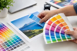
Colour should work with your brand identity and your venue. Dark backgrounds can look striking but require sufficient contrast for white or light text. Pale colours may feel fresh and modern, yet can show stains more easily on unlaminated stock. Ask for a printed proof or sample where possible, because colours viewed on a screen do not always reproduce exactly on paper.
Include useful details without overwhelming the page. Dietary icons, spice indicators and allergen prompts can improve confidence, particularly when they are consistent and explained clearly. For a detailed allergen list, it may be better to provide a separate sheet or advise guests to speak with staff, rather than squeezing complex information into every menu panel.
Build updates into your restaurant menu printing plan
Menu printing is rarely a one-time order. Prices move, supplier availability changes and seasonal dishes deserve room to shine. A smart print plan separates the pieces that must last from those that should be easy to refresh.
For example, print durable covers, brand story pages or core drinks lists in larger quantities, then produce seasonal inserts in smaller runs. Digital printing is particularly useful for short runs, fast updates and menu variations across different outlets. Offset printing can offer strong value for larger volumes with stable artwork, especially when colour consistency is a priority.
Order quantities should reflect your service pattern, not just the lowest per-unit price. Having enough menus for every occupied seat is ideal in formal dining, while shared menus may be acceptable in a casual concept. Always allow for damaged copies, new tables and replacements. Ordering a modest buffer avoids an urgent reprint when service is at its busiest.
If your restaurant runs delivery, catering or events, consider how printed menus connect with other materials. Matching takeaway inserts, table tent cards, food packaging stickers, loyalty cards and promotional flyers create a more recognisable brand experience. A one-stop solution can also simplify colour matching and production coordination across those items.
Finishing details that strengthen the experience
Finishing should add purpose, not decoration for its own sake. Rounded corners can make a frequently handled menu feel more comfortable and reduce bent edges. Die-cut shapes may suit a playful café, themed bar or children’s menu, but they need to remain practical for stacking and storage.
Spot UV can draw attention to a logo, signature dish or pattern by adding a gloss contrast to a matt surface. Foil stamping and embossing can give a premium menu cover greater presence, particularly for hotels, private dining rooms and celebratory concepts. These options are most effective when used with restraint. A finish that looks elegant on a cover may be unnecessary on a menu that changes every month.
Binding also shapes usability. Saddle-stitched booklets lie reasonably flat and suit modest page counts. Ring binding allows pages to turn easily but can look less formal. Loose inserts in a menu cover provide excellent update flexibility, provided the inserts are secure and staff can replace them quickly before service.
Prepare artwork that prints cleanly
A strong file helps prevent delays and unexpected results. Set artwork to the final size, use high-resolution images and keep important text safely away from trim edges. Most printed menus need bleed, which is extra artwork beyond the final cut line so background colours and images run cleanly to the edge.
Check prices, spelling, dish names, dietary labels and contact details with more than one pair of eyes. This is not glamorous work, but a typo on a menu can be more expensive than a late design tweak. If you are unsure about folds, finishes or file setup, ask for artwork guidance before production begins.
For a menu that works as hard as your kitchen and front-of-house team, choose materials and finishing with real service conditions in mind. 2B Printing can help turn your concept into a polished printed piece that looks right on the table, stands up to daily use and keeps your brand memorable long after the meal.