A product launch no longer has to begin with thousands of identical boxes sitting in a warehouse. For growing brands, short run packaging trends are making it possible to test a new flavour, enter a seasonal campaign or refine a retail look without committing to a large inventory before demand is proven. The opportunity is not simply to print fewer units. It is to make every pack work harder for your brand.
For Singapore businesses managing tight storage, fast-moving promotions and demanding customer expectations, flexible quantities can be a practical commercial advantage. The best results come from matching the trend to the product, channel and campaign objective rather than adding visual effects for their own sake.
Why short run packaging trends matter now
Traditional packaging production rewards volume. That model still makes sense for a proven product with stable demand, especially where unit cost is the main priority. But many businesses are working differently. Product ranges change more often, retail promotions move quickly, online orders call for a stronger unboxing experience, and customers expect brands to feel relevant rather than generic.
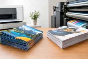
Digital print production has made shorter quantities more viable, with crisp colour reproduction and greater room for variable designs. A café can introduce a limited festive sleeve, a beauty brand can trial two label directions, and an event organiser can create branded snack packs for a single corporate function. Instead of treating packaging as a fixed operational expense, brands can use it as a responsive marketing asset.
There is a trade-off. Short runs may carry a higher cost per unit than a high-volume offset order, particularly with complex structures or premium finishing. The value lies in reducing obsolete stock, avoiding a costly redesign across thousands of pieces, and learning what customers actually choose.
The short run packaging trends shaping better launches
Smaller collections, sharper stories
One broad product line is increasingly giving way to smaller, more intentional collections. Limited flavours, anniversary editions, collaboration packs and campaign-specific designs create a reason to look again. This approach is particularly effective for food and beverage, retail gifts, cosmetics and lifestyle products, where the packaging is part of the purchase decision.
The key is to give the edition a clear purpose. A Lunar New Year design, for example, should feel connected to the brand rather than look like a standard pack with a festive graphic added at the last minute. Use a defined campaign message, consistent colours and a format suited to the product – such as a paper bag, carton sleeve, sticker seal or stand-up pouch.
Personalisation beyond a printed name
Variable-data printing allows selected details to change from one item to the next without rebuilding the entire design. This could mean individual names, different promotional codes, a branch-specific message or a series of collectible illustrations. For corporate gifting and event packs, even a small amount of personalisation can turn a useful item into a memorable brand touchpoint.
Personalisation should not compromise operational clarity. Product name, key instructions, legal information and expiry details still need to be easy to find. Build a stable design framework first, then reserve a defined area for changing content. This keeps the pack recognisable while allowing the campaign to feel personal.
Sustainable choices with a practical purpose
Customers are paying more attention to unnecessary layers, oversized boxes and materials that are difficult to separate after use. The more useful packaging trend is not a single material or a fashionable green claim. It is thoughtful reduction: right-sizing the pack, selecting suitable paper or board, and avoiding excess components where they do not protect the product or improve presentation.
Material choice depends on what the packaging must do. A takeaway food item has different moisture and hygiene requirements from a premium apparel gift. A fragile retail product may need internal protection that a pouch does not provide. Clear, accurate communication is better than broad environmental promises. If a package is recyclable only when components are separated, make that instruction simple for the customer to follow.
Tactile finishes for premium attention
When shelves and online feeds are crowded, touch can make a quiet but powerful difference. Embossing, debossing, foil stamping, Spot UV and textured stocks can draw attention to a logo, product name or graphic detail. These finishes are especially effective on smaller packaging runs because brands can reserve them for launches, gift sets and high-value items rather than applying them to every everyday pack.
Restraint matters. A dark carton with a single foil-marked logo can look more premium than a design using foil, embossing and gloss in every available space. Choose one visual hero and let the finish support it. This is also where physical samples are valuable: a finish that looks striking on screen may be too subtle, too reflective or too busy once produced.
Packaging built for unboxing and content
For direct-to-consumer sales, the parcel is often the first physical interaction a customer has with your brand. This has pushed brands to think beyond the external shipping carton. Branded tissue, stickers, thank-you cards, belly bands and product inserts can create a more considered reveal without requiring an elaborate custom box.
The goal is not to turn every delivery into a social-media stunt. It is to make the experience feel organised, protected and recognisably yours. Consider what the customer sees first, how easily the product can be opened and whether the insert gives useful information, such as care guidance, a reward code or details of the next collection. Each element should earn its place.
Localised packs for different audiences
Shorter production runs make it easier to adapt packaging to a location, retailer, language requirement or audience segment. A product supplied to a hotel can carry a co-branded sleeve. A multi-site business can use branch-specific labels. A corporate event can have packaging aligned with its theme and colour palette.
This flexibility needs disciplined brand control. Keep the logo placement, typefaces, core colours and mandatory information consistent, even when campaign visuals change. A clear artwork template prevents every variation becoming a separate design project and makes reordering much easier.
How to choose the right approach
Start with the commercial question, not the print treatment. Are you validating a new product, creating urgency for a promotion, improving the gifting experience or solving a packaging problem such as poor product protection? Your answer determines the format, quantity and budget.
Next, map the customer journey. A pouch displayed on a retail shelf needs strong front-facing impact. A carton shipped by post needs durability and a design that survives handling. A paper bag for an event should be comfortable to carry, visible in photographs and large enough for its contents. A good design becomes more effective when it responds to the real-world moment in which it will be used.
Then plan quantities with an honest view of demand. A very small run is ideal for a first test or a time-sensitive event. Once a design is proven, a larger order may offer better value. Many brands benefit from a staged approach: produce an initial run, gather sales and customer feedback, then refine or scale with confidence.
Finally, allow time for artwork checks and prototypes. Packaging involves practical details that can be missed in a flat digital file: fold lines, bleed, barcode placement, colour shifts across materials and the space required for seals or labels. Early guidance can prevent a beautiful design from becoming difficult to manufacture or use.
Make flexibility part of your brand system
Short-run production works best when it is not treated as an emergency solution. Create a packaging system with repeatable elements: approved logo files, colour references, copy blocks, dielines and a small set of finishing options. This gives your team room to create fresh campaigns while keeping every item unmistakably on-brand.
For businesses sourcing packaging alongside labels, inserts, point-of-sale displays, event signage and promotional materials, a one-stop production partner can also reduce the risk of mismatched colours and fragmented deadlines. 2B Printing can help turn those separate touchpoints into a polished, practical package that is ready for retail, delivery or the next campaign.
The most valuable trend is not a particular finish, material or format. It is the ability to produce packaging that fits the moment, proves its value and gives your next idea a professional place to be seen.